Vitamin D
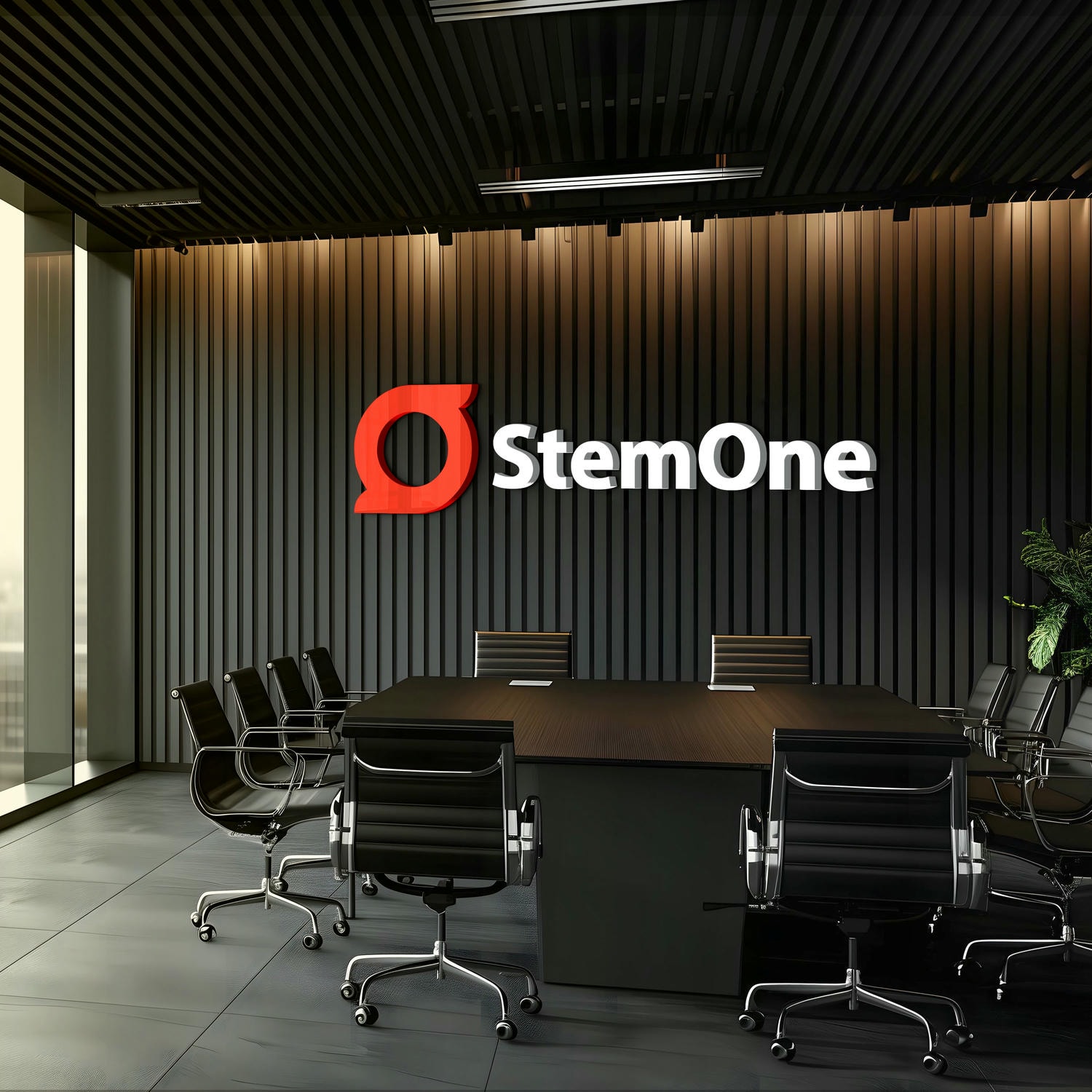
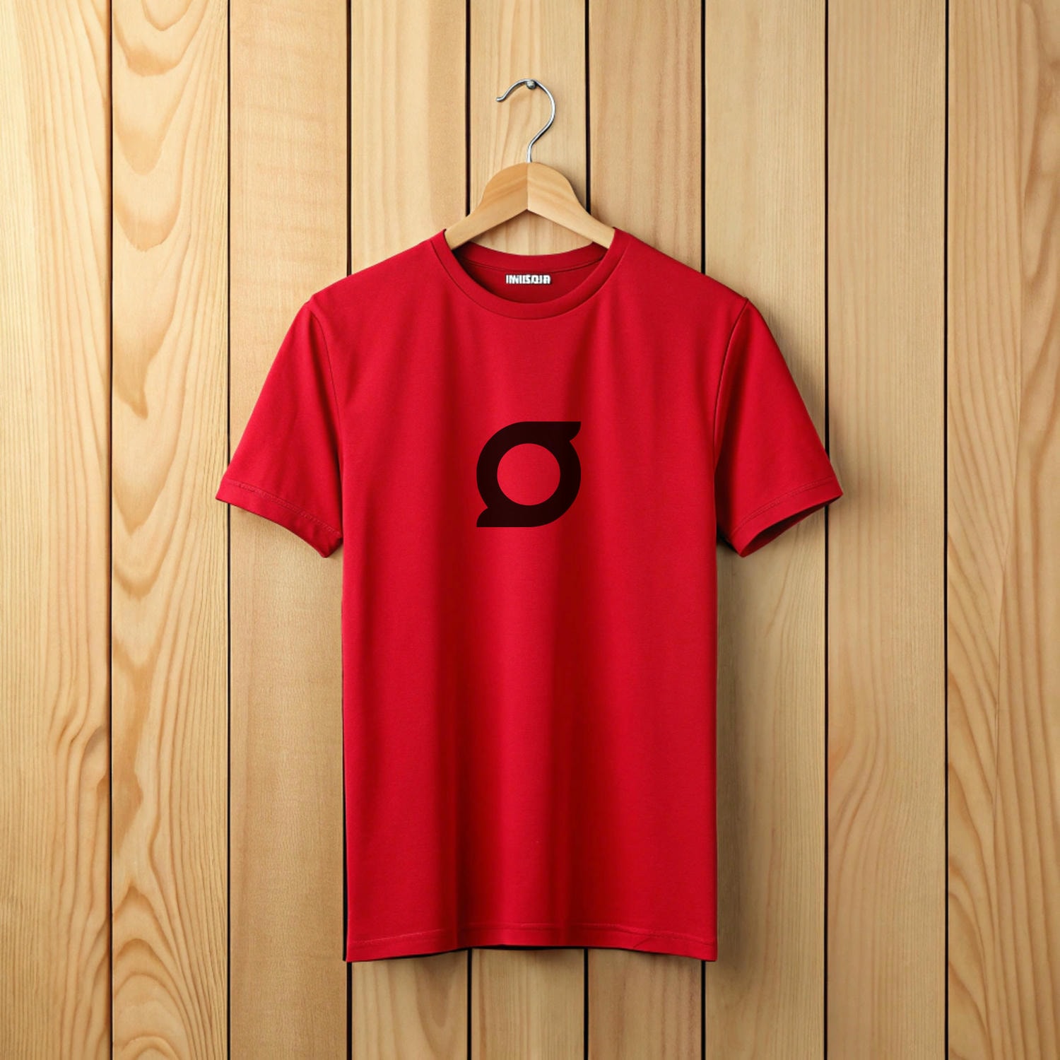
When designing the Brand Identity and Brand Symbol for StemOne – a unique stem cell therapy product by Alkem Labs, we interestingly used the shape of the letter ‘O’ that looks like a stem cell and a circle.
Symbolising new beginnings and the sun’s life-giving energy, the circle represents totality, precision and discipline – core to the brand’s values.


What’s more, it is a symbol of equality, honesty and fairness with every point in the circle being equidistant from its centre. The curves add agility, while the shape itself signifies infinity and continuity.
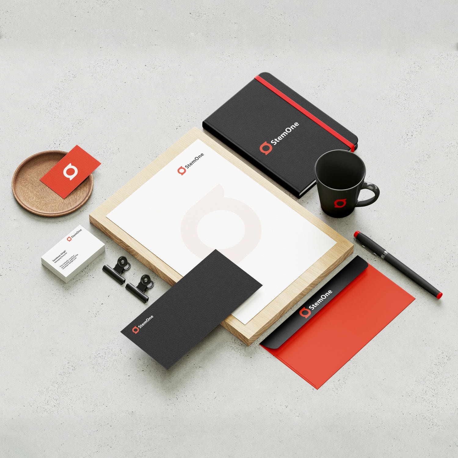
The Stationery and Merchandise design reflects StemOne’s premium, classy and cohesive brand identity.
The Stationery and Merchandise design reflects StemOne’s premium, classy and cohesive brand identity.