Vitamin D
The Golden Goenka Group, a forward-thinking company based out of Kolkata, approached us to create the Brand Identity and Brand Manual for their new endeavour – an asset management company.
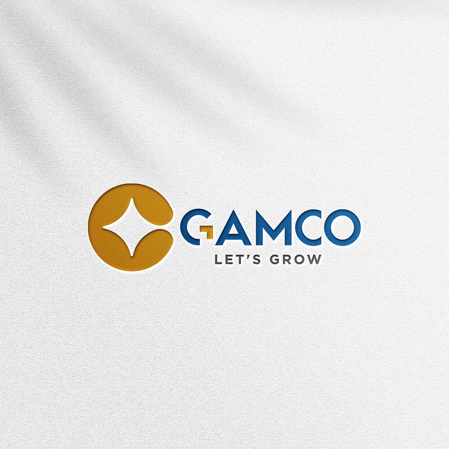
We came up with a name that stemmed from their own identity and legacy – GAMCO (Goenka Asset Management Company), while also carrying forward the trust and growth associated with them.
The tagline ‘Let’s Grow’ is a short, simple yet powerful line. It says so many things without saying too much and conveys a clear focus on growth. The interesting part being that it has a sense and sound of growing together.
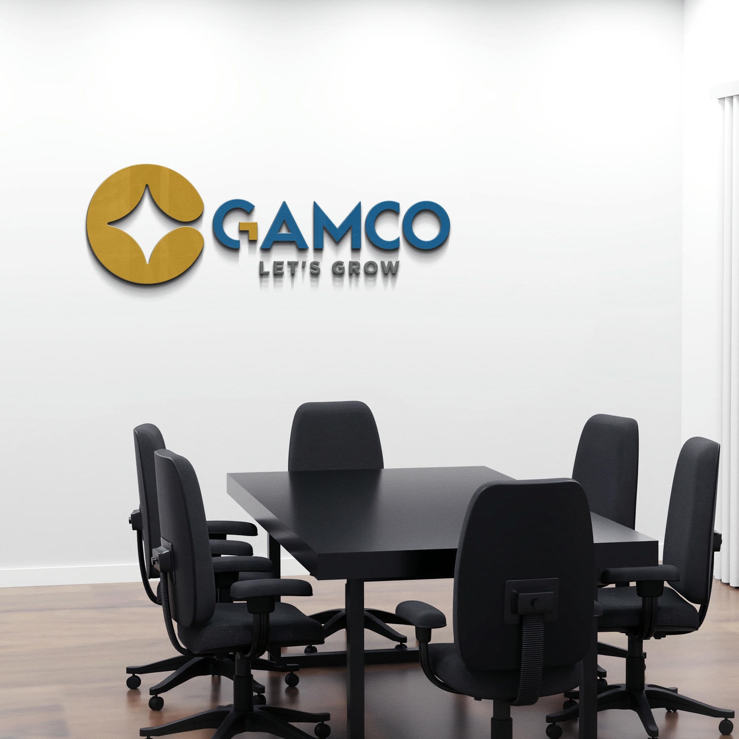
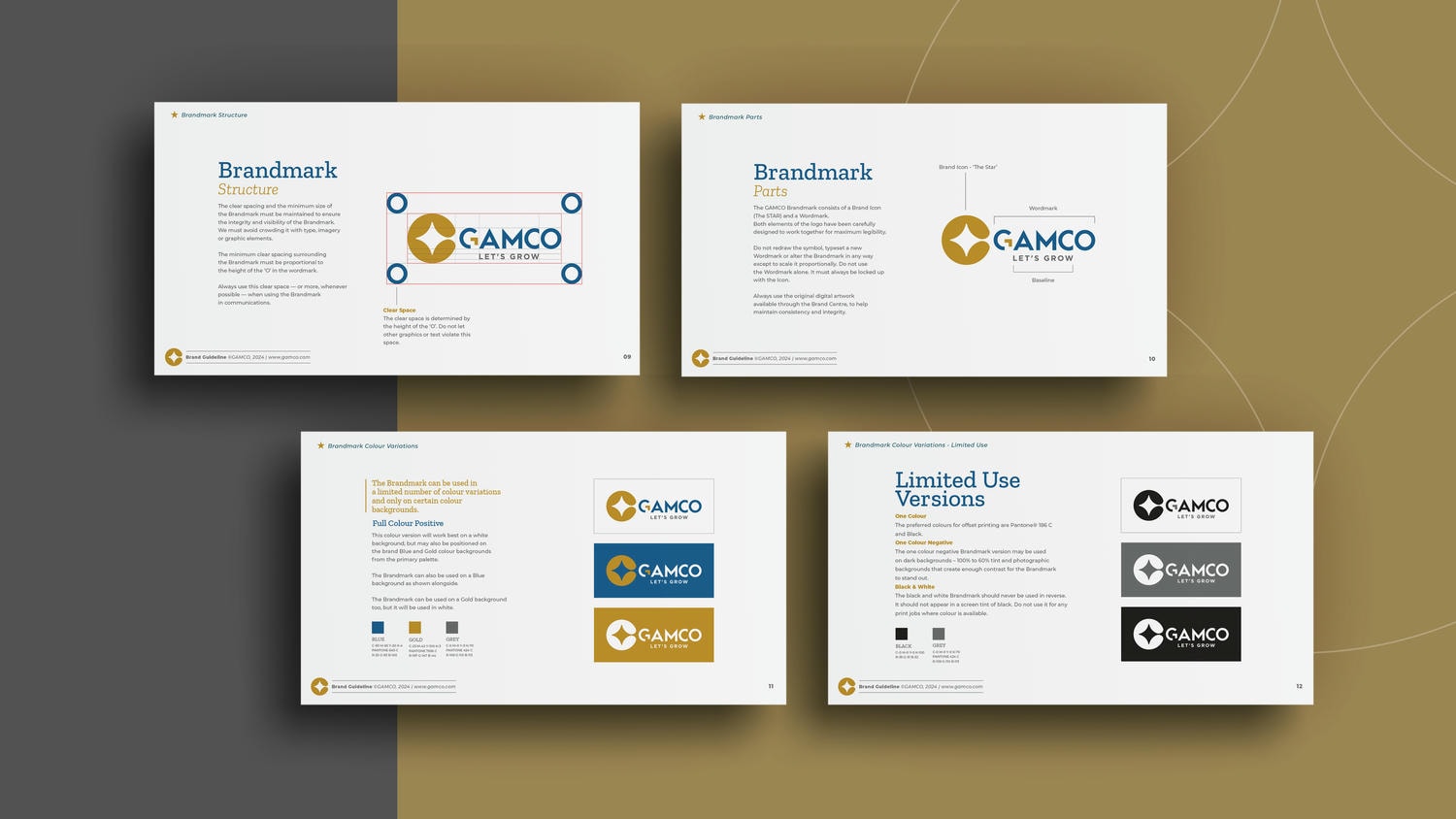
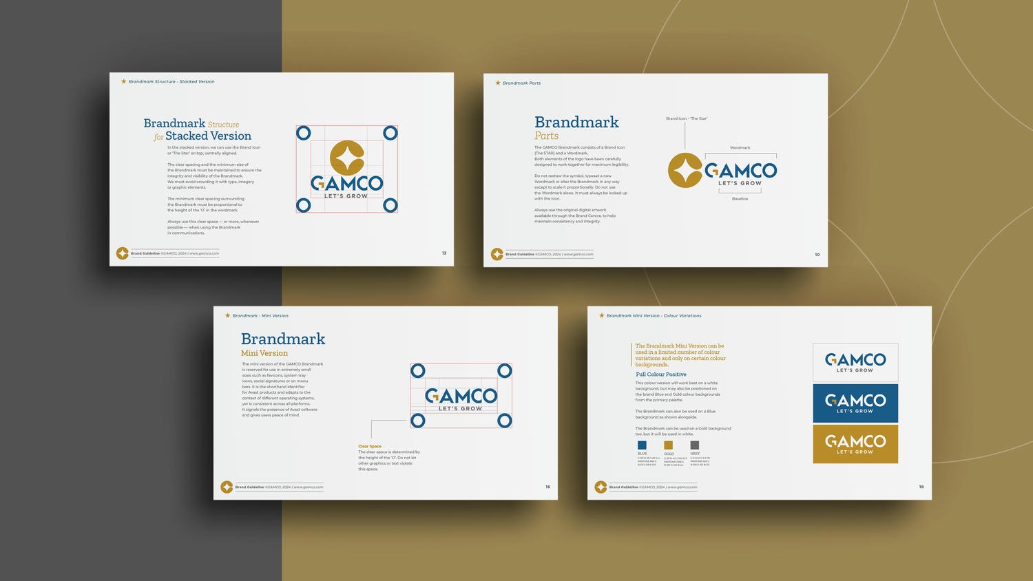
The Brand Identity was designed to incorporate the shape of the letter G while also integrating the growth story using the upward pointing arrow as well as an edge, essentially signifying that GAMCO as an organisation has a clear edge over its competitors.
The design’s minimalism and simplicity reflect the company’s commitment to achieving excellence by mastering the basics. While the bold and sharp font signifies the organisation’s keen vision and strong focus on growth.
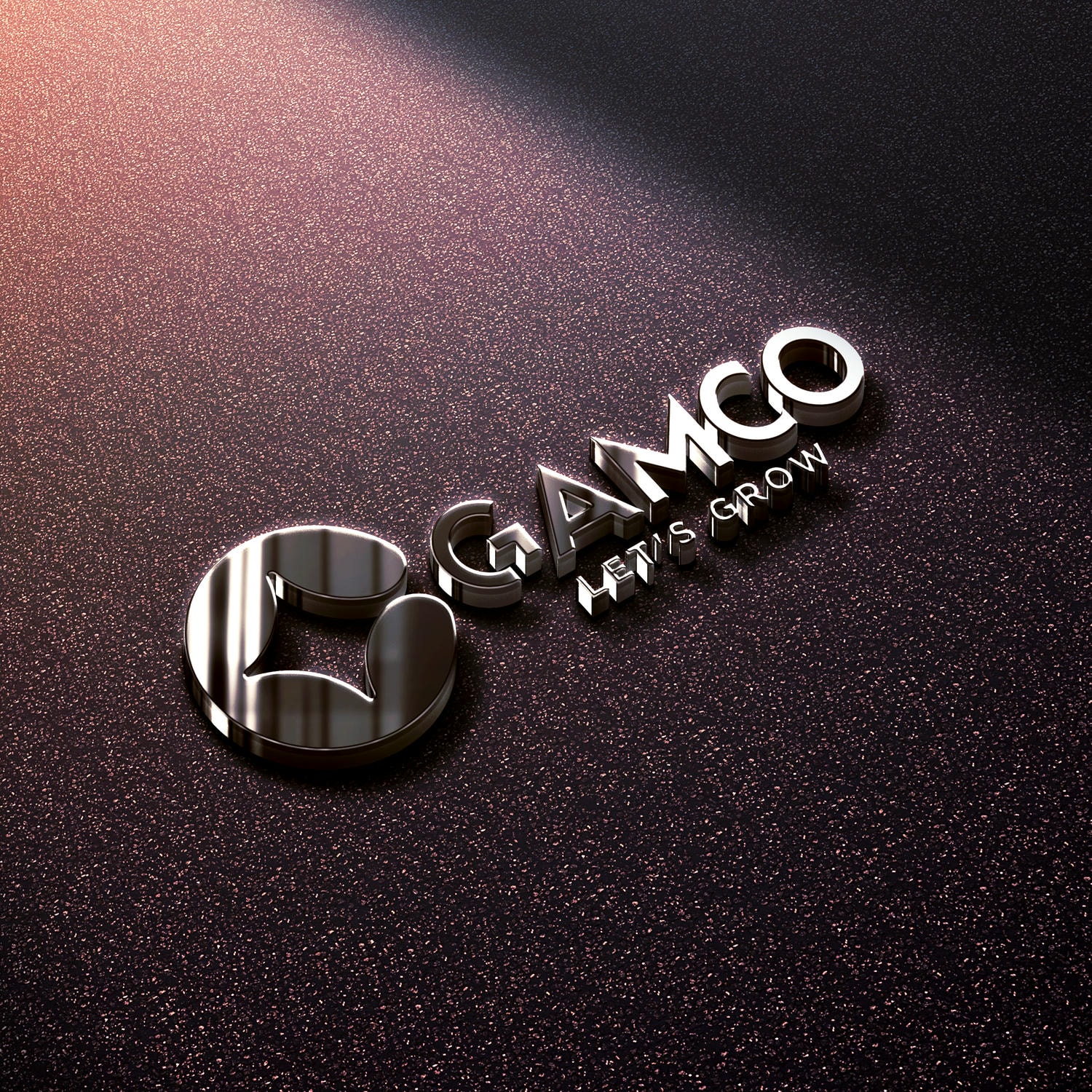
The Silver colour evokes sophistication, elegance, grace, timelessness, reliability and innovation.
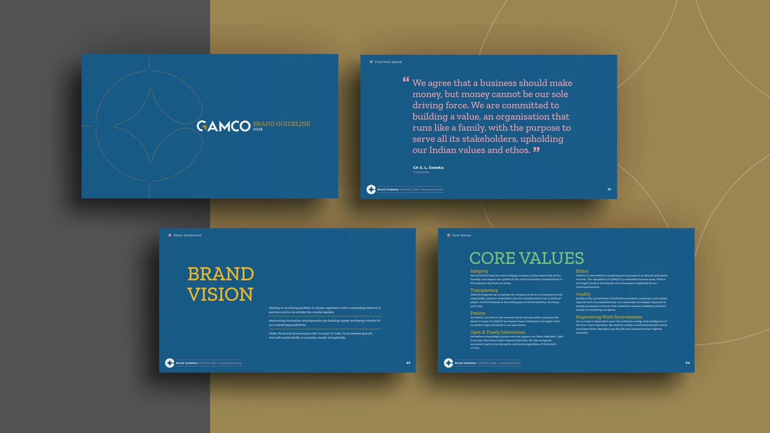
We set out to redefine the brand’s visual identity, creating a distinctive look and feel that reflects its core values of trust, growth and financial expertise.
We set out to redefine the brand’s visual identity, creating a distinctive look and feel that reflects its core values of trust, growth and financial expertise.
We set out to redefine the brand’s visual identity, creating a distinctive look and feel that reflects its core values of trust, growth and financial expertise.
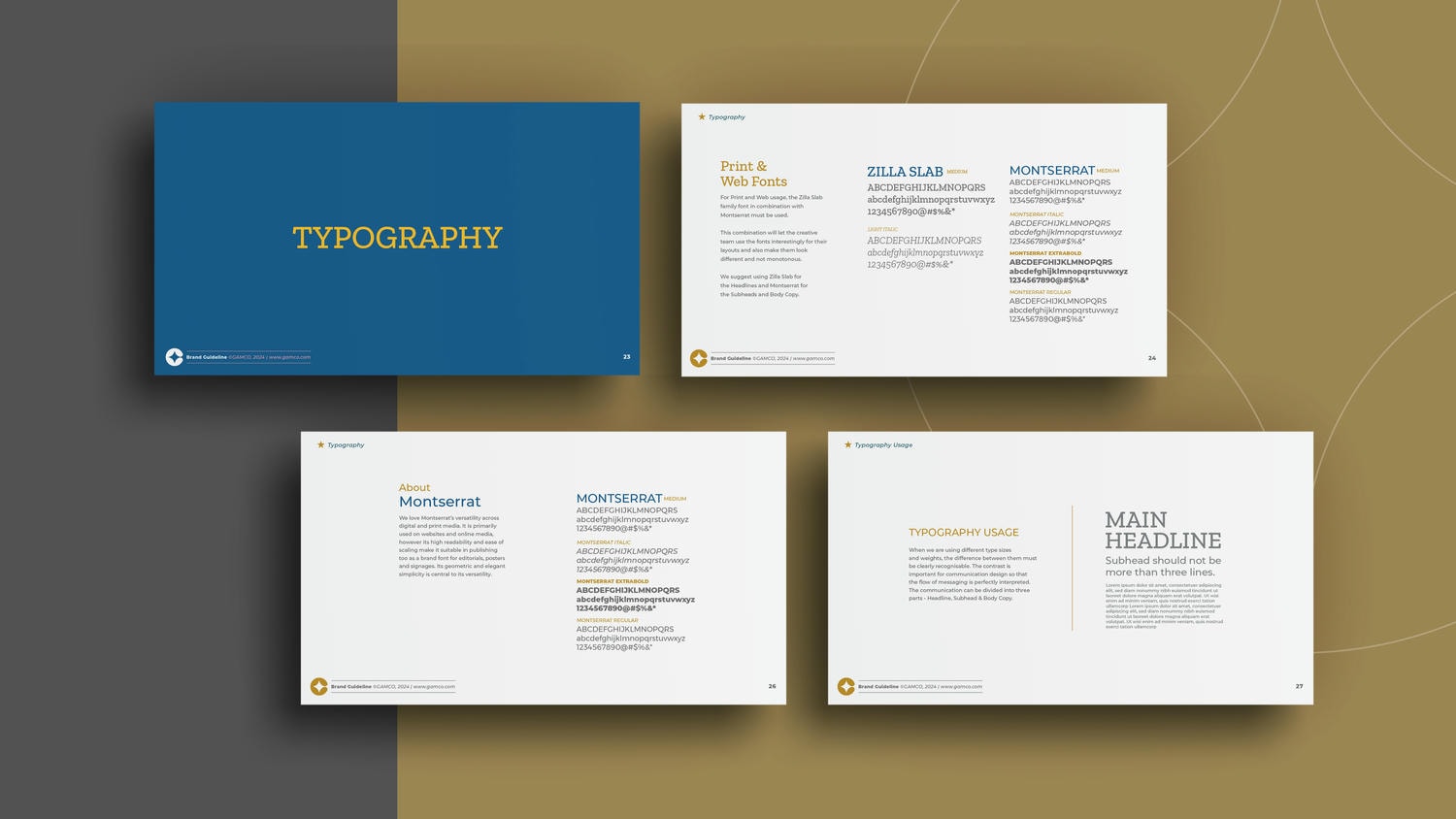
While developing a unique brand language tailored to the expectations of high value investors, we focussed on key touchpoints such as Typography, Iconography and Visual Storytelling.
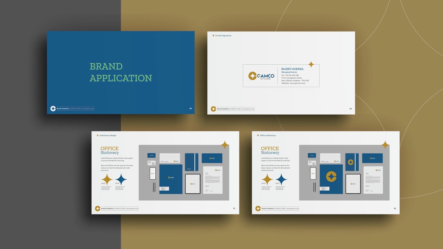
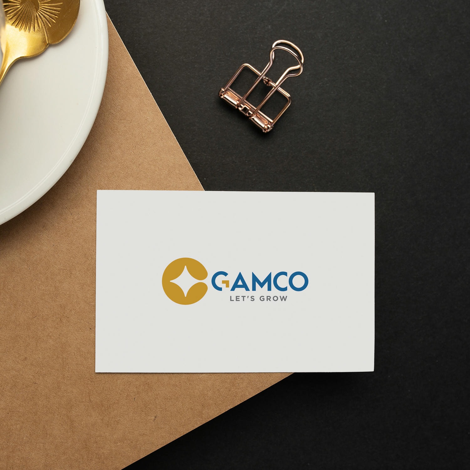
The design of Corporate Stationery and Branded Materials was meticulously crafted to align with the brand’s identity while maintaining a bold and sophisticated presence.
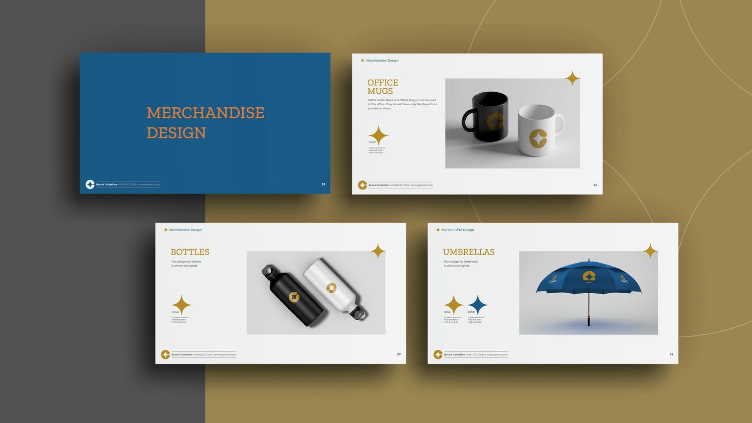
The design of Corporate Stationery and Branded Materials was meticulously crafted to align with the brand’s identity while maintaining a bold and sophisticated presence.
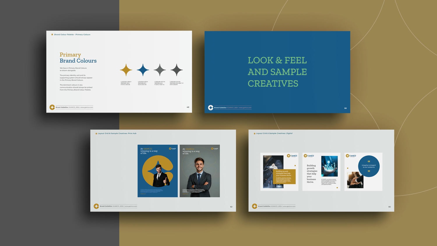
Comprehensive Print and Digital Communication Guidelines were established to ensure a cohesive, authoritative and impactful brand voice across all platforms.