Vitamin D

When we set out to design the Brand Identity for Just Potate, our goal was clear – to integrate sleek, flowing elements that convey movement and freshness, while subtly emphasising the core ingredient – Potatoes.
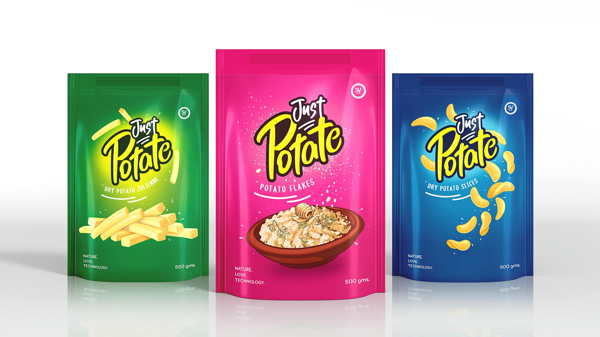
The result – a dynamic Identity that perfectly captures the essence of Just Potate, being a visual representation of the brand’s vibrant and innovative spirit, standing out with simplicity and charm.
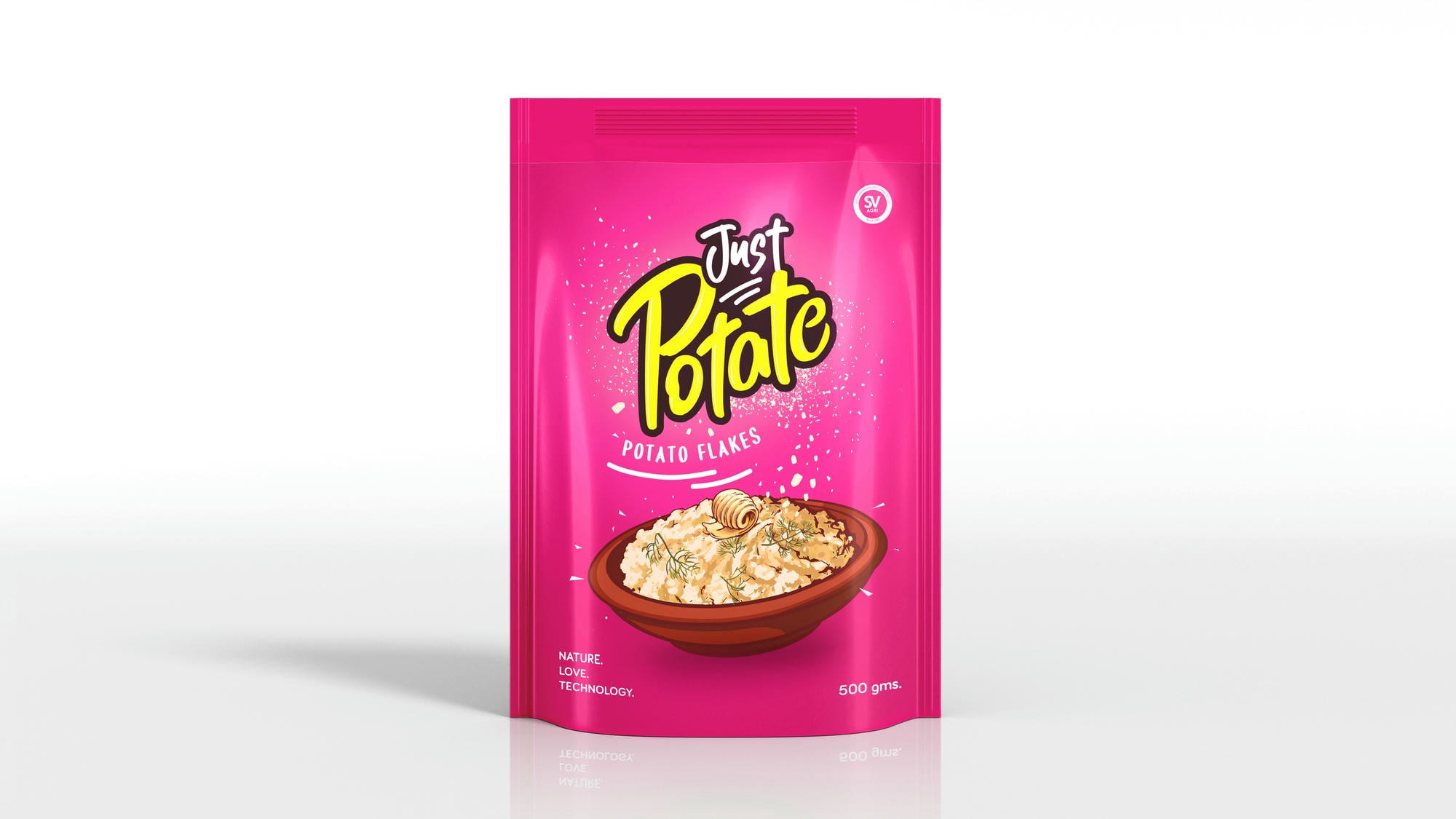
Keeping in mind the category codes, we designed the range of packaging to be vibrant and playful, with a clean, clutter-free look that enhances the overall appeal.

Every design is a perfect balance between fun and minimalism, ensuring it grabs attention on the shelves while maintaining a fresh and modern aesthetic.
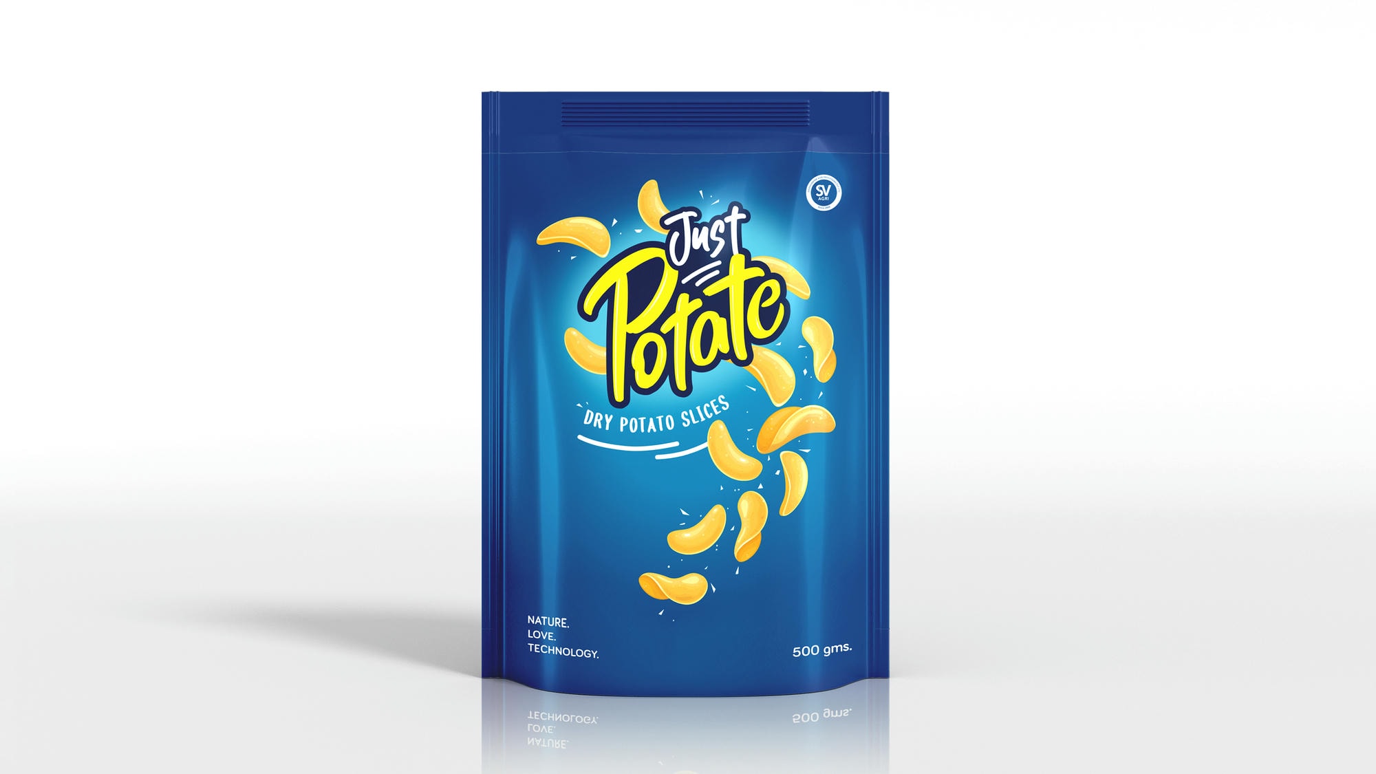
The clean and minimal backgrounds allow the illustrative food shots to stand out without overwhelming the packaging, creating a balance between artistic expression and clear product communication.