Vitamin D
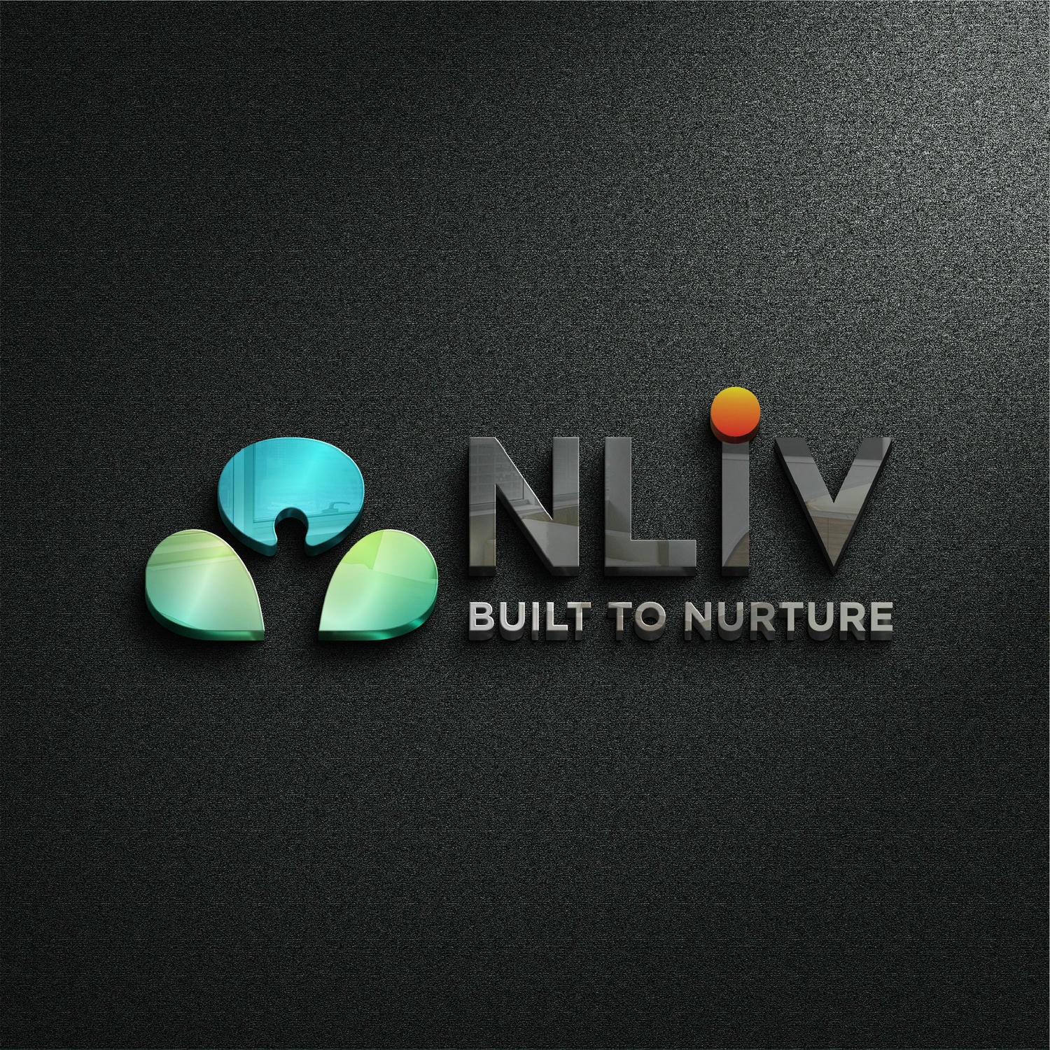
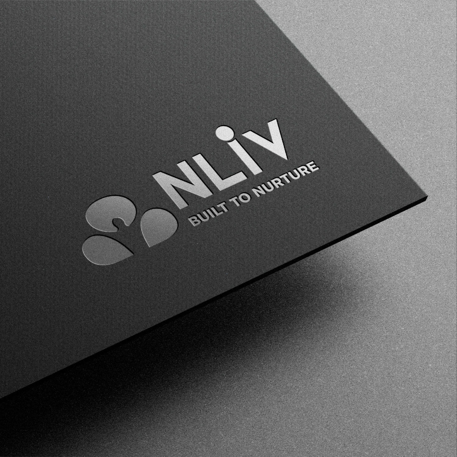
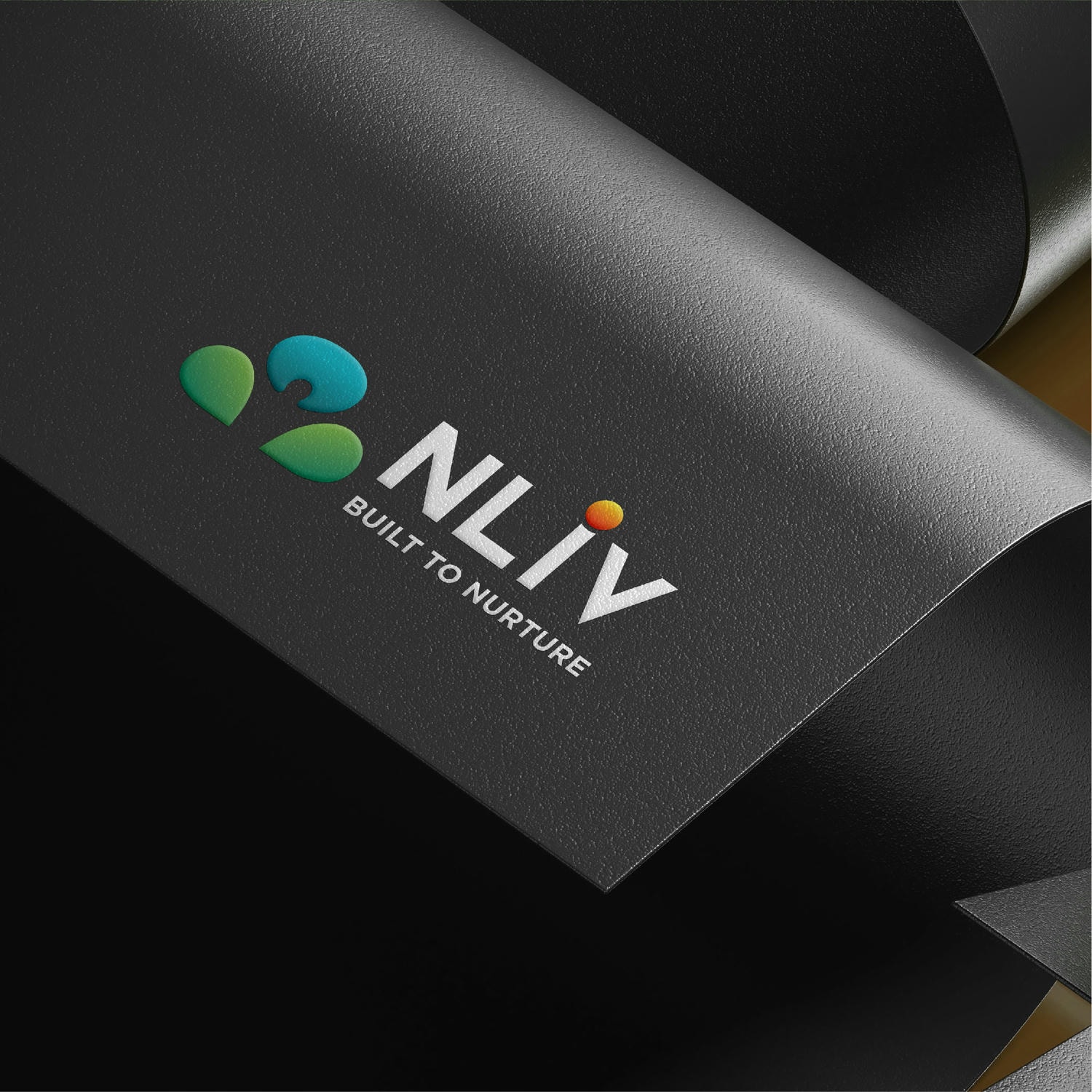
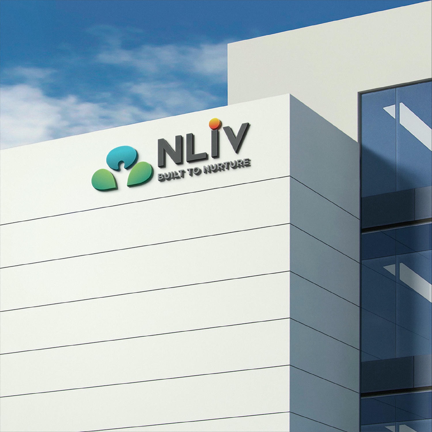
When a Pune-based real estate brand approached us to develop the branding for their nature-infused homes, we came up with the name NLiv – where the ‘N’ doesn’t just represent nature, but also makes the name sound like the word ‘Enlive’ which means the infusion of life.
The tagline, ‘Built to Nurture’ was conceptualised to reflect the brand’s core values of growth and care.
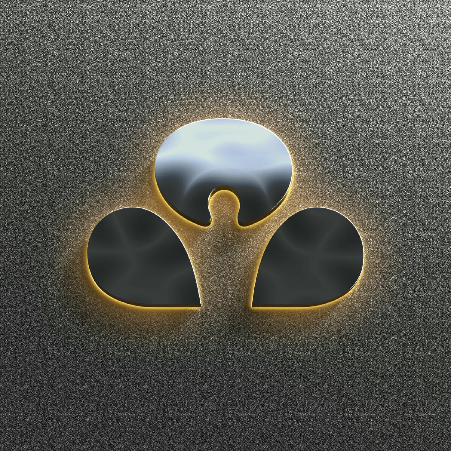
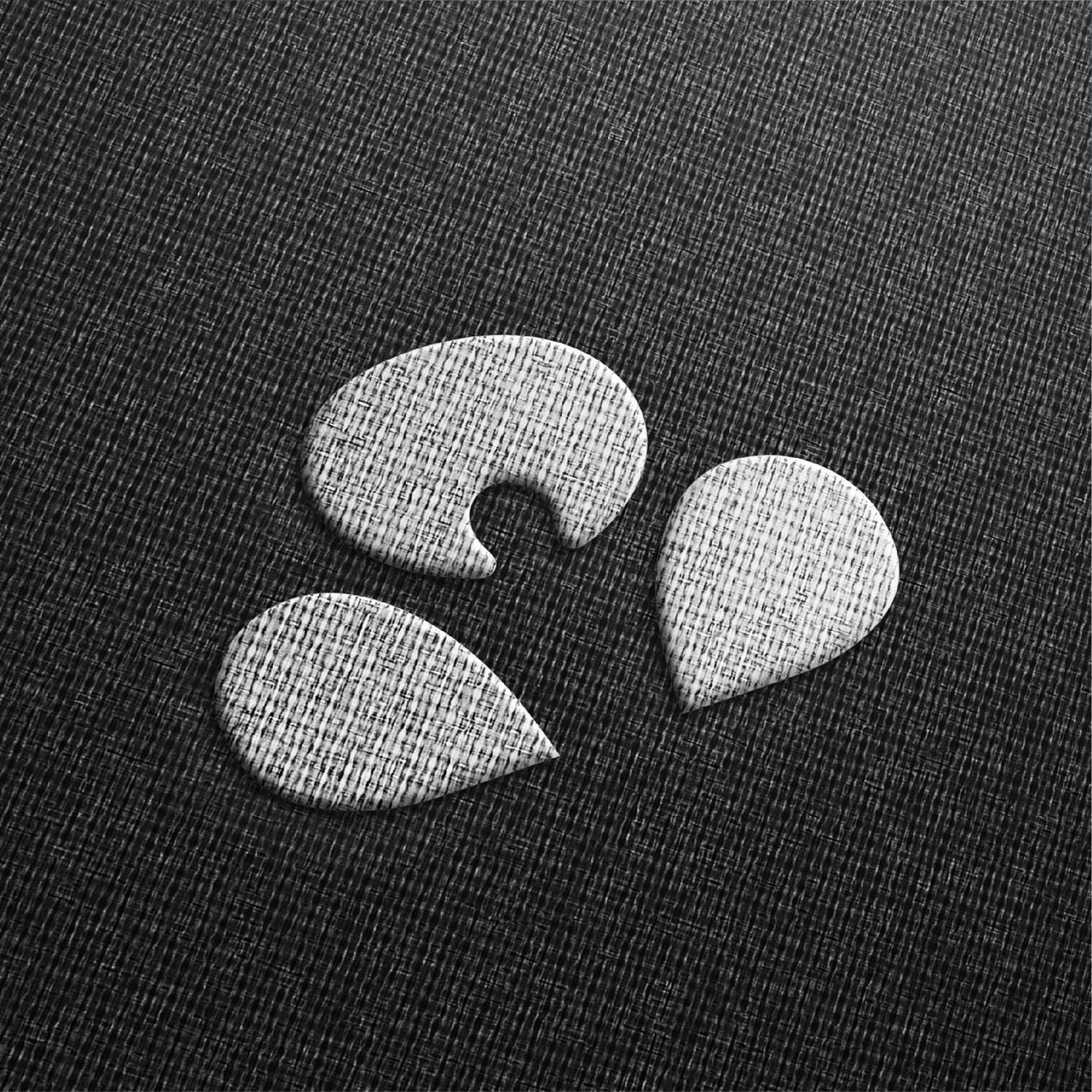
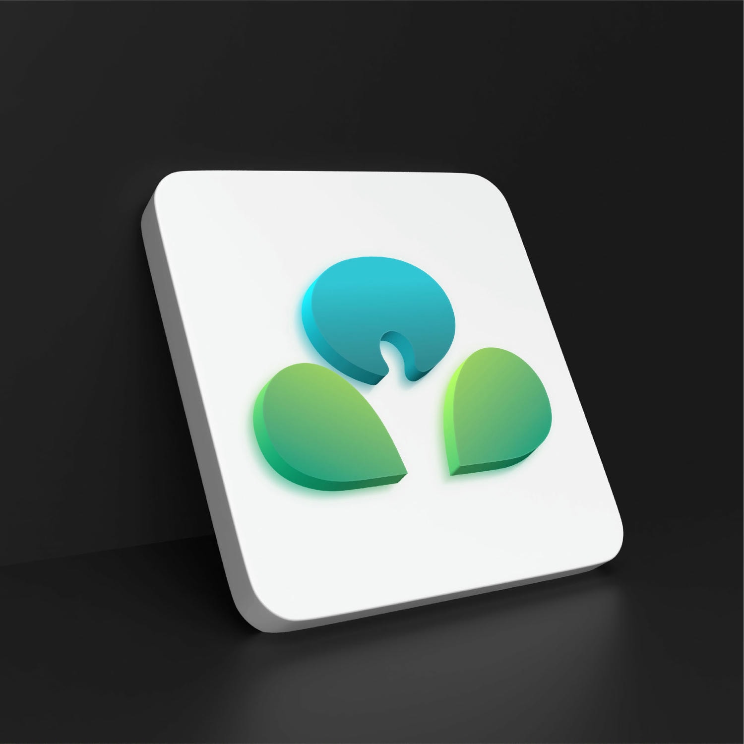
We designed the Brand Identity to embody the essence of the brand. By merging the shapes of a relaxed human figure with natural elements like a tree, leaf and flower, we have crafted a seamless, unique icon that symbolises a peaceful, joyful life in nature.
The thoughtful integration of the Icon with the Wordmark, particularly how the letter ‘i’ resembles a tree, underscores the importance of personal happiness and well-being when choosing a home close to nature.
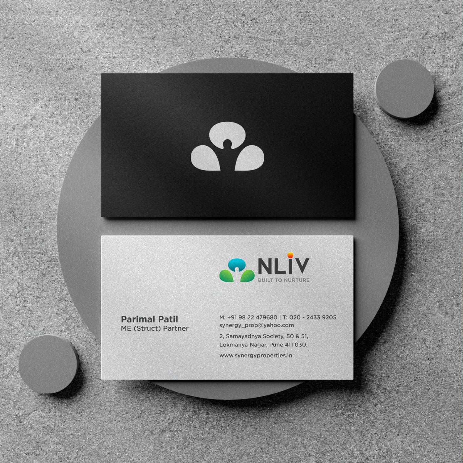
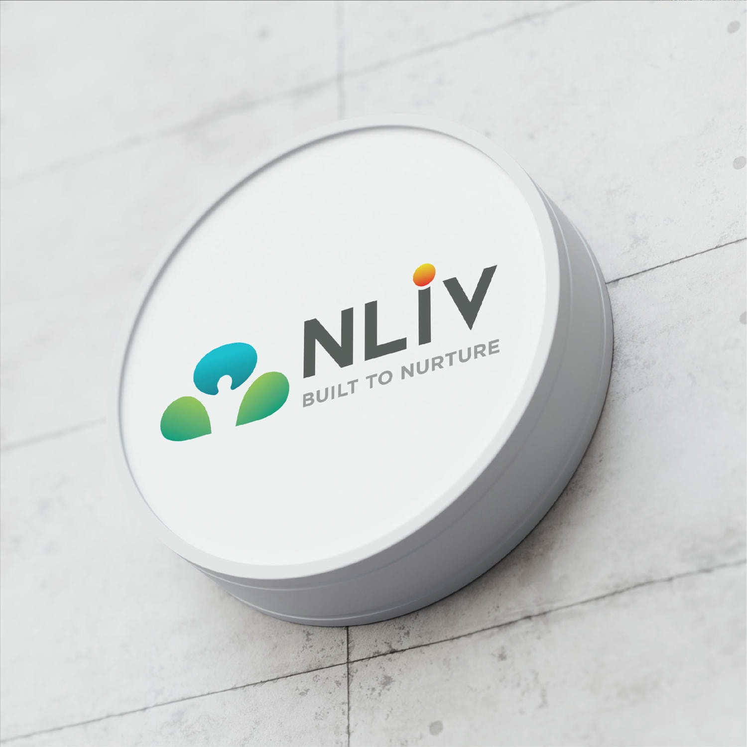
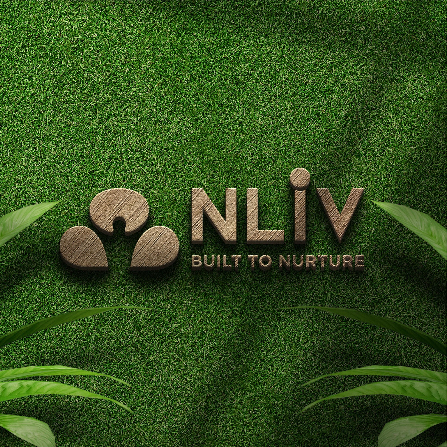
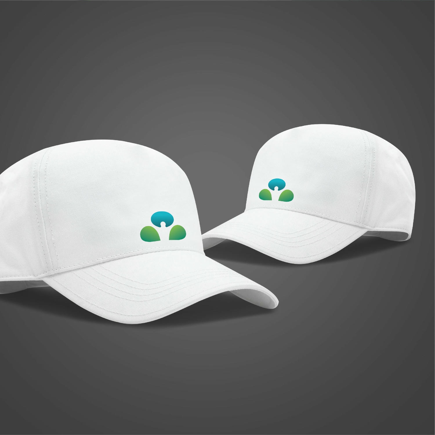
Every element of the branding is carefully designed to communicate both simplicity and a deep connection to nature with clean, minimal and nature-friendly layouts.
Every element of the branding is carefully designed to communicate both simplicity and a deep connection to nature with clean, minimal and nature-friendly layouts.

Every element of the branding is carefully designed to communicate both simplicity and a deep connection to nature with clean, minimal and nature-friendly layouts.
The use of Green symbolises new beginnings and harmony, reflecting the brand’s fresh start and the nature connection. Black adds power and elegance, while White represents purity and simplicity, bringing in a sense of vitality, creativity and clarity.

The use of Green symbolises new beginnings and harmony, reflecting the brand’s fresh start and the nature connection. Black adds power and elegance, while White represents purity and simplicity, bringing in a sense of vitality, creativity and clarity.