Vitamin D
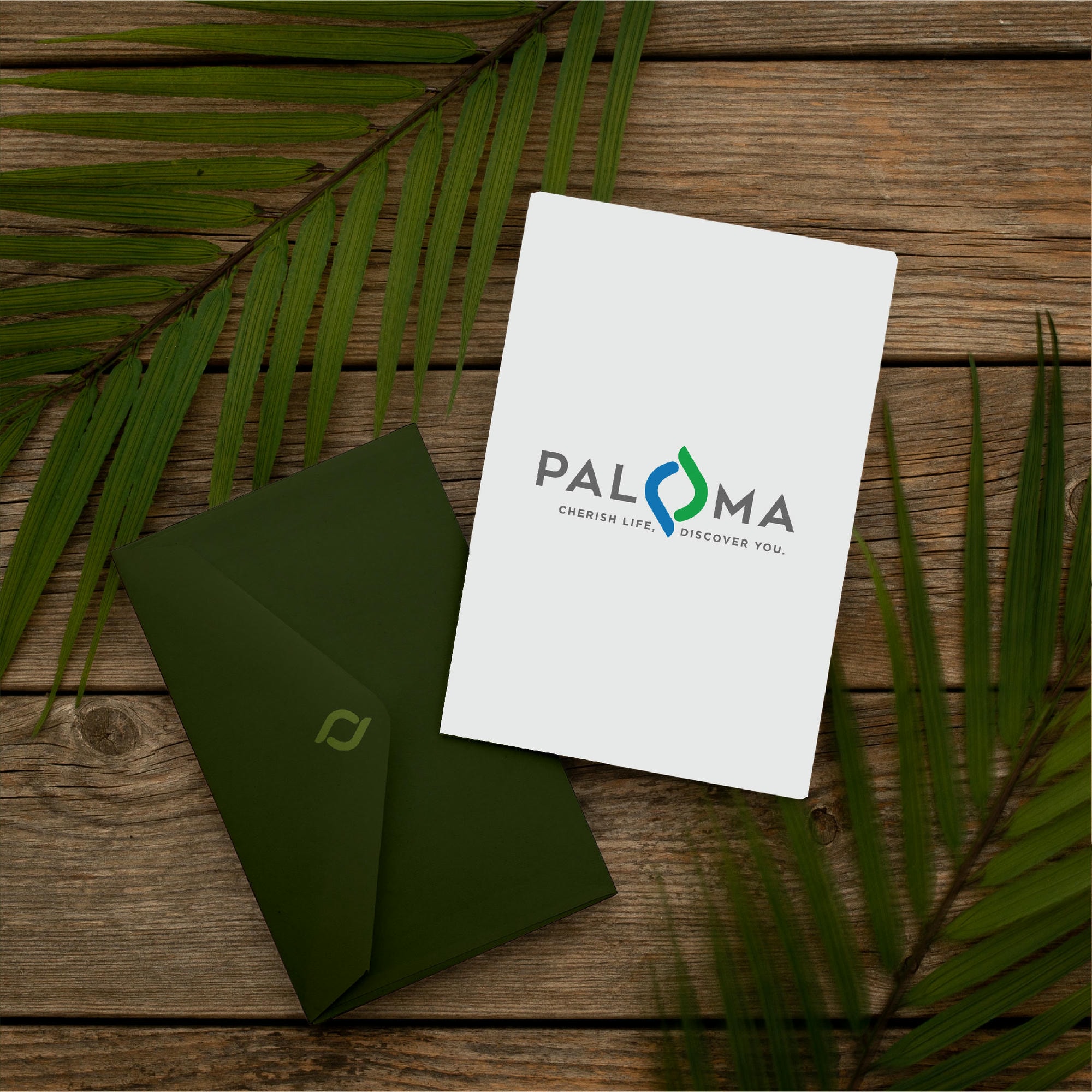
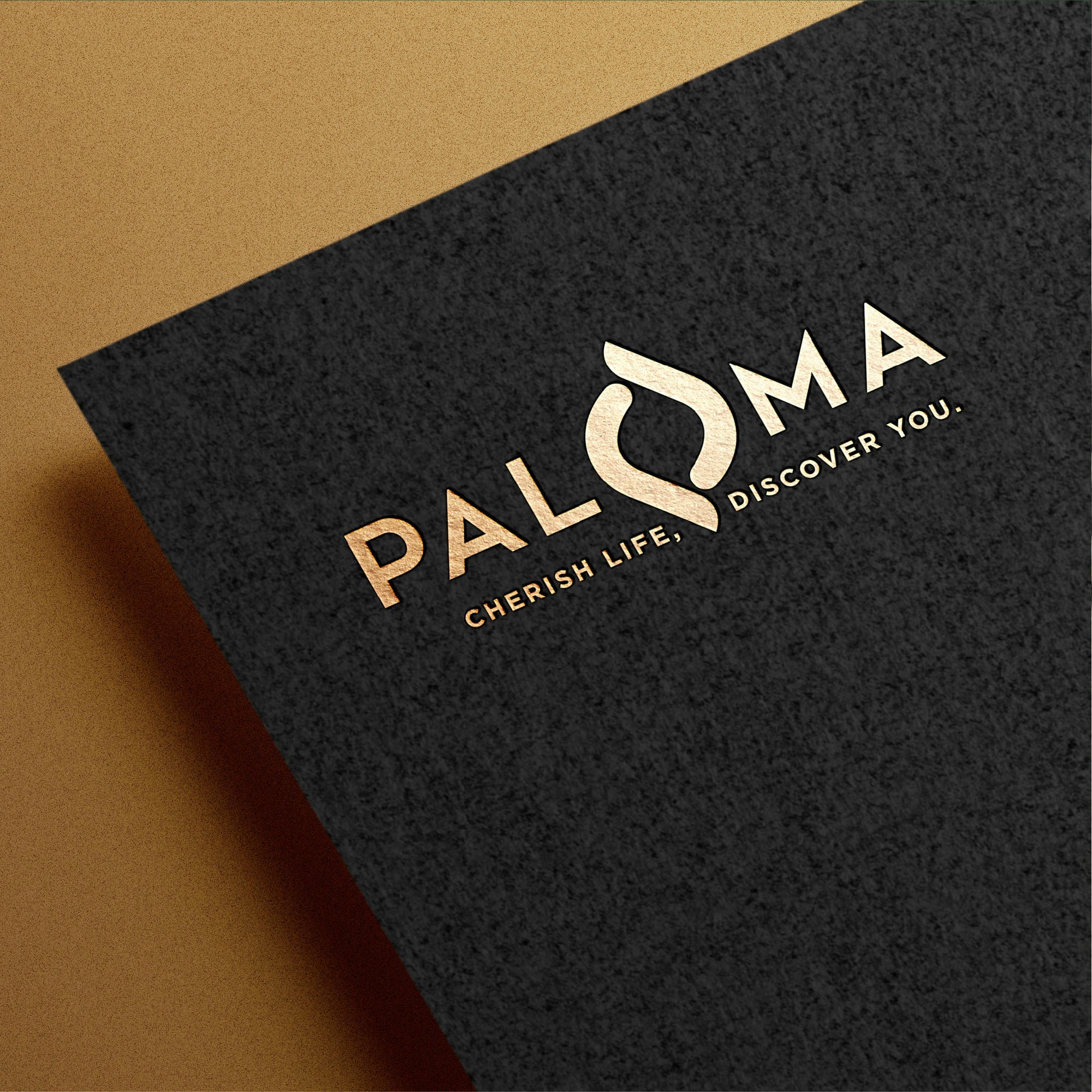
This logo design perfectly embodies the spirit of brand ‘Paloma’ – a real estate company based out of Pune.

With its core energy drawn from passion and intuition, the logo symbolises the relentless drive of the brand.
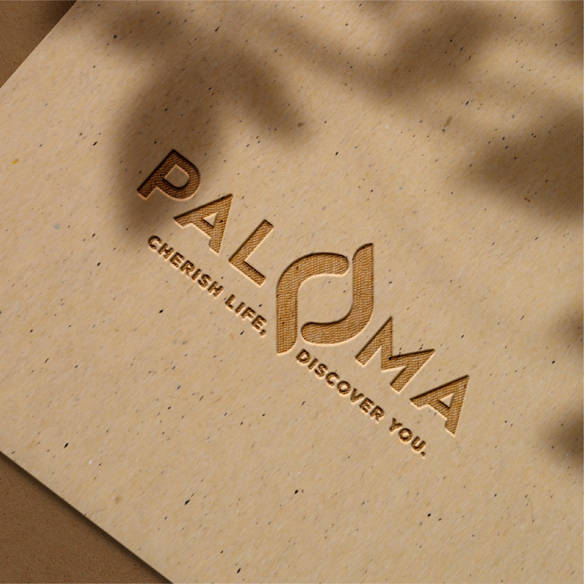
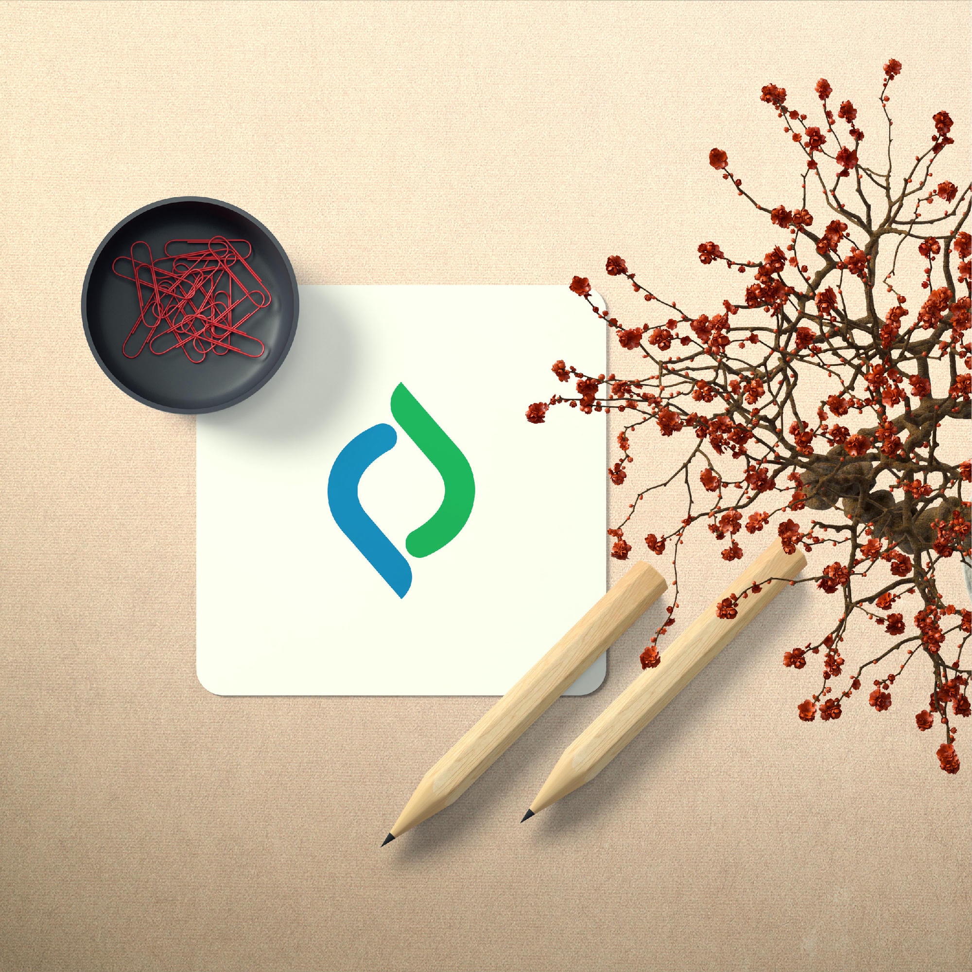
The shape of the third eye represents the clarity of instinct that guides the brand forward. It flows into the shape of a dynamic, forward-moving wheel, reflecting progress and continuous evolution.
With its core energy drawn from passion and intuition, the logo symbolises the relentless drive of the brand.
The shape of the third eye represents the clarity of instinct that guides the brand forward. It flows into the shape of a dynamic, forward-moving wheel, reflecting progress and continuous evolution.
At its heart, the logo design unites two powerful energies, creating a space where true transformation and innovation come to life.

At its heart, the logo design unites two powerful energies, creating a space where true transformation and innovation come to life.


At its heart, the logo design unites two powerful energies, creating a space where true transformation and innovation come to life.
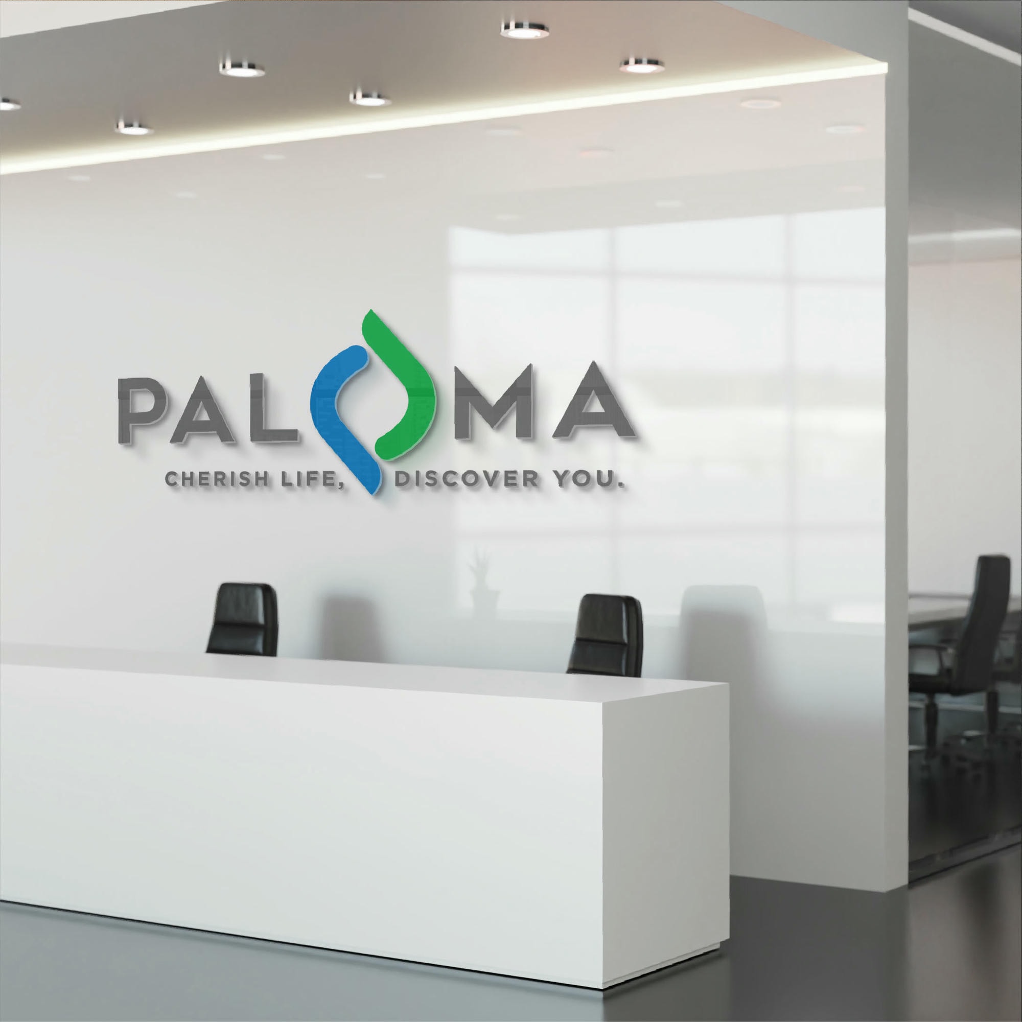

Blue being the colour of the sky and Green representing the earth, we have used these colours to signify that as a brand we are here to deliver outstanding versions of every thing in between the two.
The shades of Grey bring in balance, neutrality and professionalism.
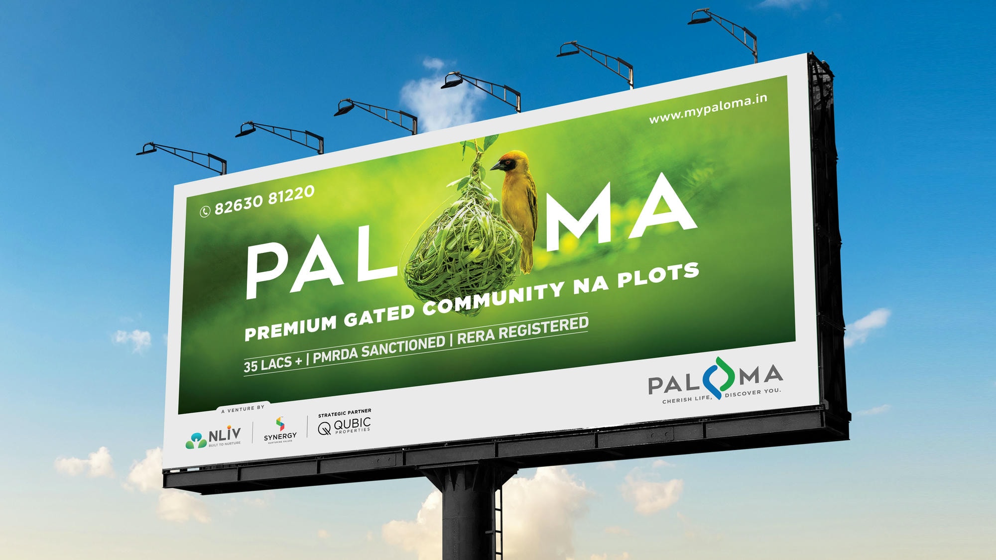
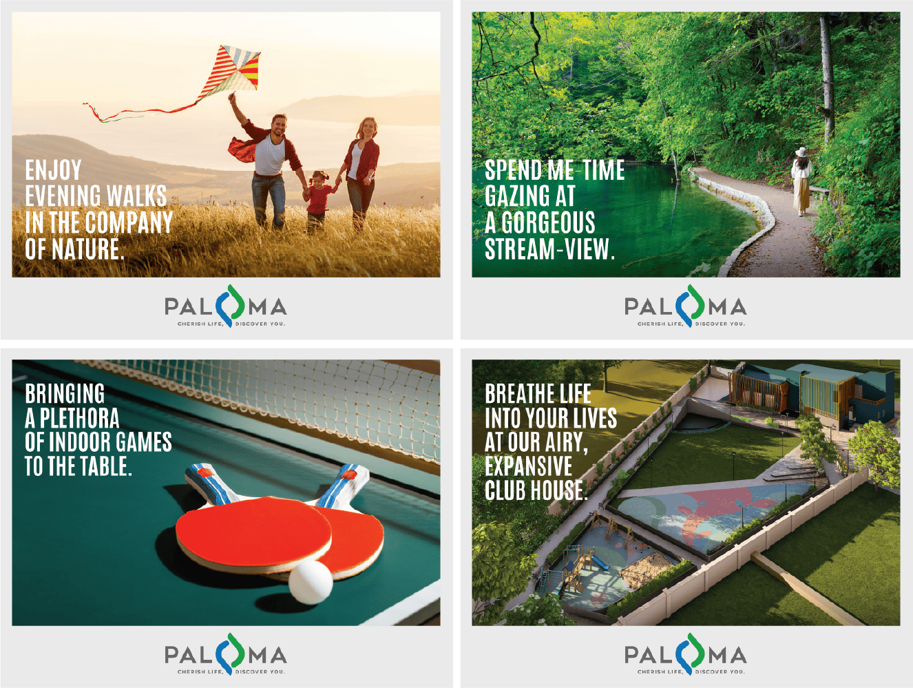
We developed a captivating teaser campaign that cleverly utilised the logo to weave visual elements that seamlessly told the brand’s story.
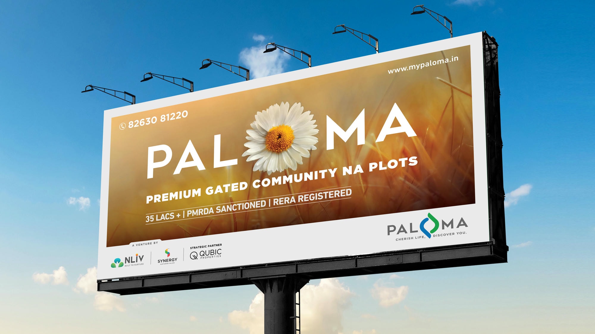
We developed a captivating teaser campaign that cleverly utilised the logo to weave visual elements that seamlessly told the brand’s story.
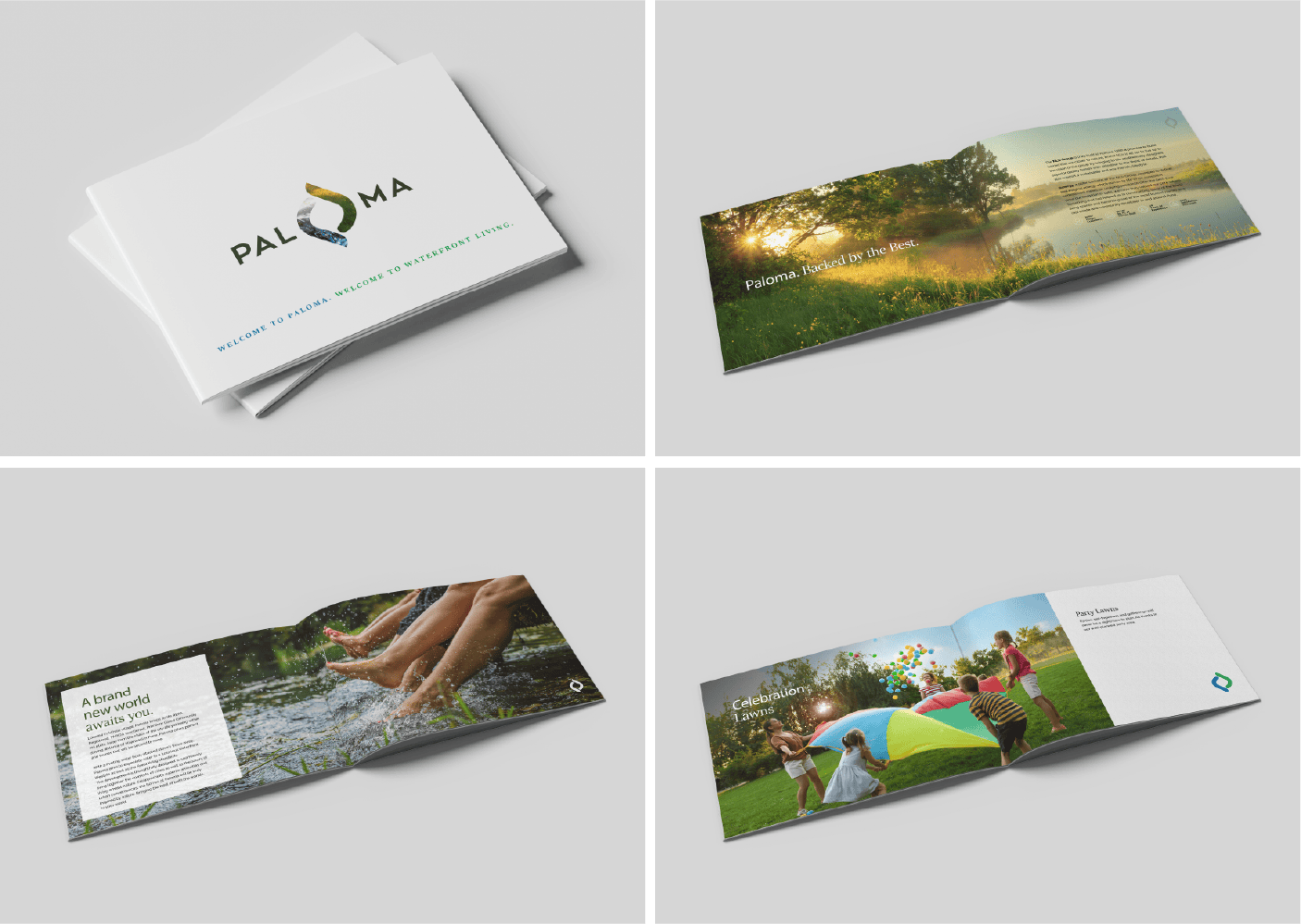
The Brochure design is a perfect blend of elegance and clarity, presenting the brand’s story and values through striking visuals and informative content.
The Site Branding creatives combine captivating visuals with compelling copy, offering an immersive experience that truly reflects the brand’s essence.