Vitamin D
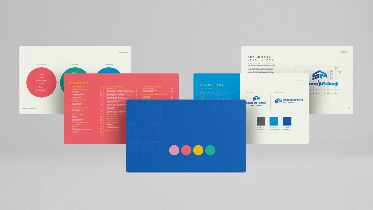
Designing the Brand Symbol and Brand Guideline for one of the leading realty brands in India was no mean task.

We took up the challenge and set out to redefine the language of the brand in a relevant yet interesting way.

We came up with the ‘Rings of Refresh’ that represented the young and vibrant shades of the brand.

Setting each product category apart with a unique look & feel and tone of voice, based on the target audience and their preferences.
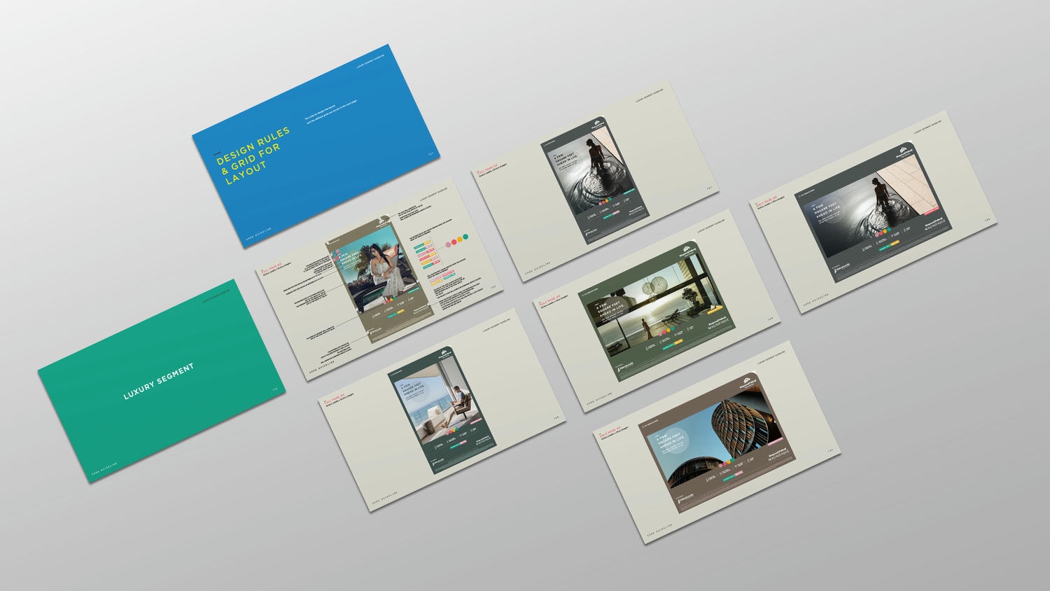
Setting each product category apart with a unique look & feel and tone of voice, based on the target audience and their preferences.

The Layout Grids were carefully crafted to define even the smallest of details, leaving nothing to assumption.
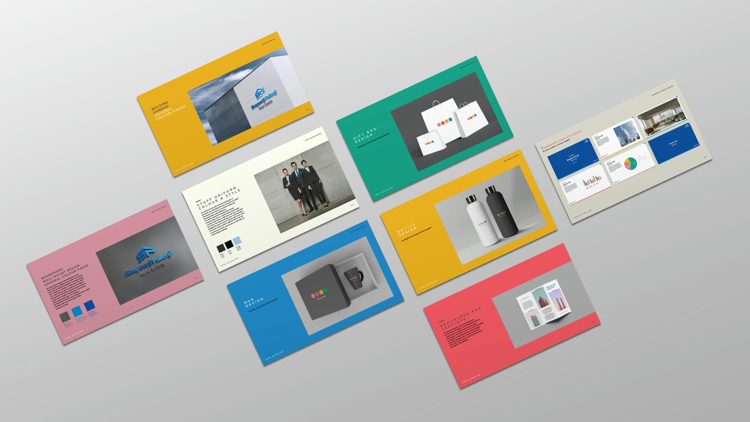
From Print, Outdoor and Digital Guidelines to Merchandise, Stationery, Signage and Powerpoint Template designs – everything was defined to the T.

From Print, Outdoor and Digital Guidelines to Merchandise, Stationery, Signage and Powerpoint Template designs – everything was defined to the T.